
The Groups report helps you compare case statistics across different dimensions of your case-management data.
Instead of looking only at the overall number of cases, you can group them by categories, units, channels, priorities, statuses, organisational levels, and other attributes. You can also add a second dimension to the chart, apply filters, and review how the selected group changes over time.
Where to find the Groups report
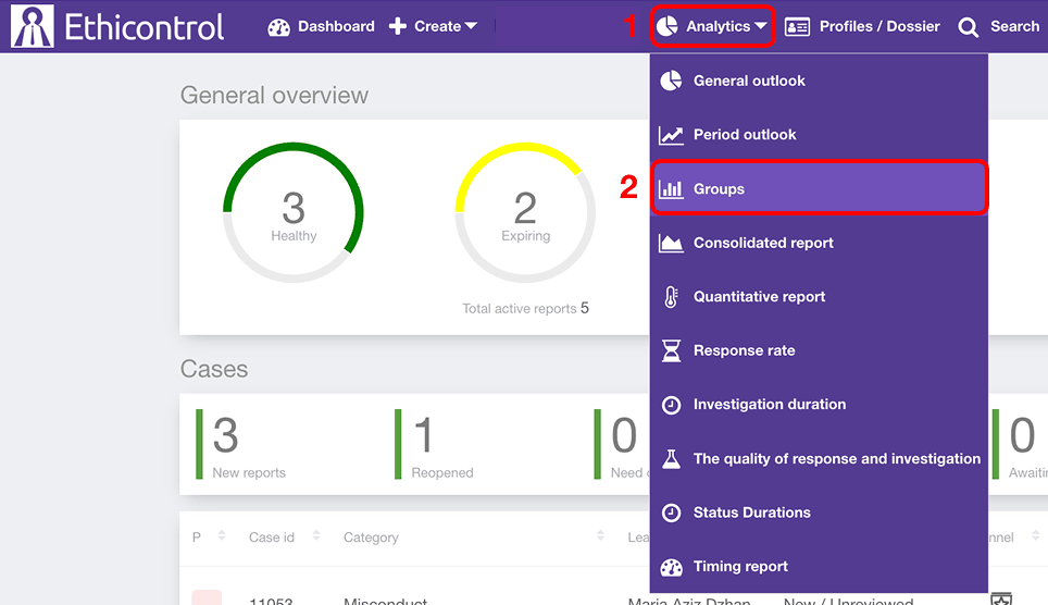 1. Open Analytics from the main navigation.
2. Select Groups.
The report includes:
- a primary grouping selector;
- chart display options;
- an optional second grouping for stacked bars;
- reporting period and filters;
- a case-count chart;
- a detailed table;
- a Dynamics chart.
Choose how to group cases

Use the first selector next to Groups to choose the main dimension for the report.
Available options may include:
- Categories
- Case class
- Units
- Channels
- Assigned
-Segments
- Disciplinary actions
- Statuses
- Regions
- Procedures
- Priorities
- Open / Closed
- Organisational level 1
- Organisational level 2
The available values depend on your organisation's configuration.
For example, select Categories to compare how many cases belong to each incident category, or select Units to compare reporting activity across organisational units.
Changing the selected dimension updates the chart and the detailed table below it.
Choose the chart type
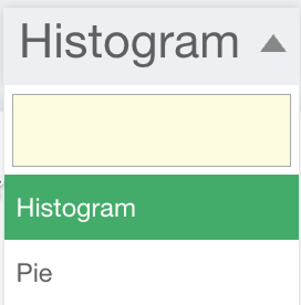
You can change how the grouped data is visualised.
For example, the report can display the results as a Histogram or Pie chart.
Use a histogram when you want to compare the number of cases between several groups directly. A pie chart can be useful when you want to see how the groups contribute to the total case volume.
Changing the chart type affects only the visual presentation of the data.
Add a second grouping with stacked bars
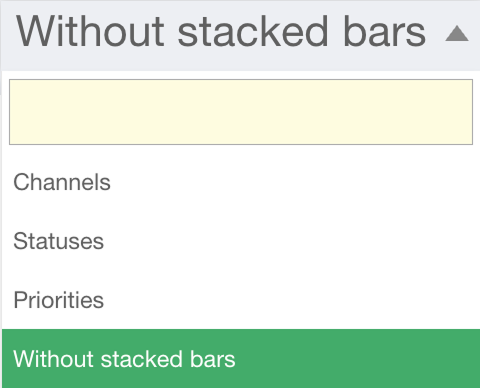
The report can also divide each primary group by an additional case attribute.
Use the secondary selector to choose:
- Channels
- Statuses
- Priorities
- Without stacked bars
For example:
select Units as the primary group and Statuses as the secondary group to see how cases in each unit are distributed across statuses;
select Categories and then Priorities to compare the priority mix within each category.
When Without stacked bars is selected, the chart shows only the total number of cases for each primary group.
This allows you to move from a simple comparison to a more detailed two-dimensional view without changing the cases included in the report.
Select the reporting period
Use the date selector to define the period included in the analysis.
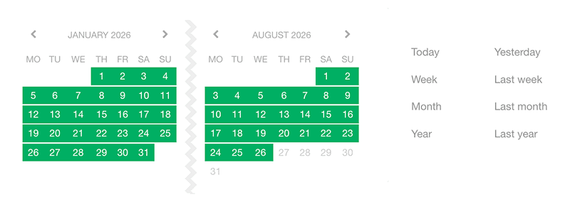
Depending on the available options, you can select a custom range or predefined periods such as:
Today;
Yesterday;
Week;
Last week;
Month;
Last month;
Year;
Last year.
Changing the period updates the report data.
Filter the report
Use the available filters to narrow the dataset before comparing groups.

Depending on your organisation's configuration, filters may include attributes such as:
Category;
Unit;
Assigned user;
Channel;
Priority;
Region;
Segment;
Procedure;
Event date / Actual incident date;
Resolution date;
other organisation-specific attributes.
Filters determine which cases are included, while the grouping selectors determine how those cases are organised in the report.
For example, you can filter the report to one region and then group the remaining cases by category.
Review the case-count chart
The main chart shows how many cases belong to each selected group.
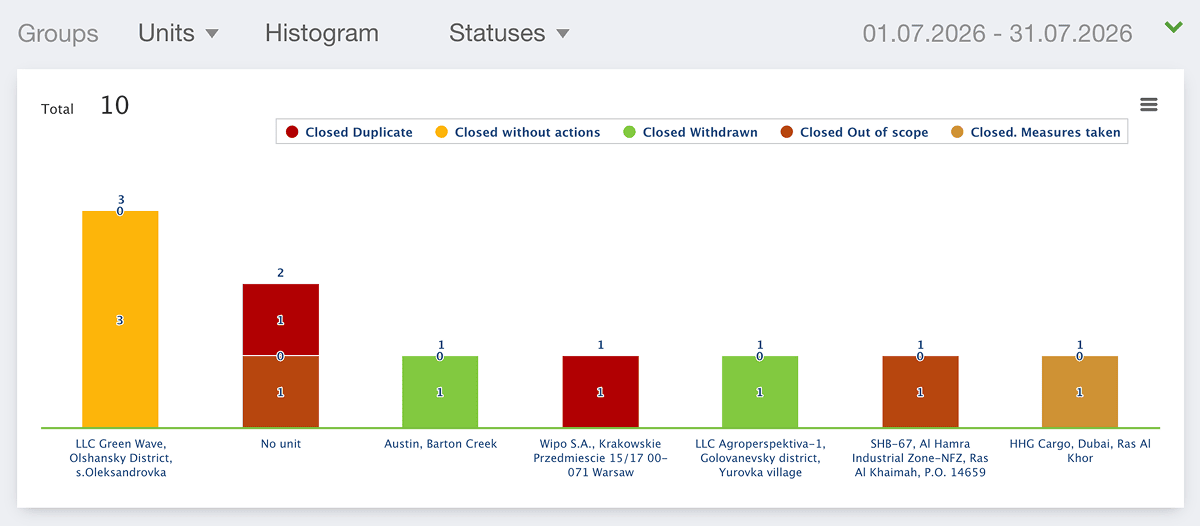
The Total value shows the overall number of cases included in the current report.
When a secondary grouping is enabled, each bar can be divided into separate segments showing how the cases within that group are distributed by channel, status, or priority.
This makes it possible to compare both overall case volume and the composition of each group.
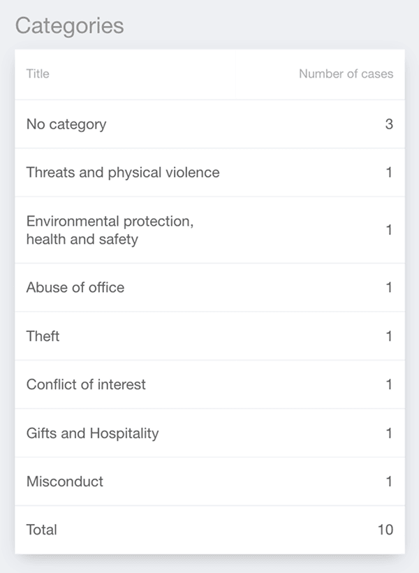
Review the detailed table
For example, when Categories is selected, the table lists each category together with its Number of cases.
Use the table when you need exact values rather than a visual comparison.
The table updates when you change the primary grouping, reporting period, or filters.
Review changes over time
The Dynamics section shows how the selected data changes during the reporting period.
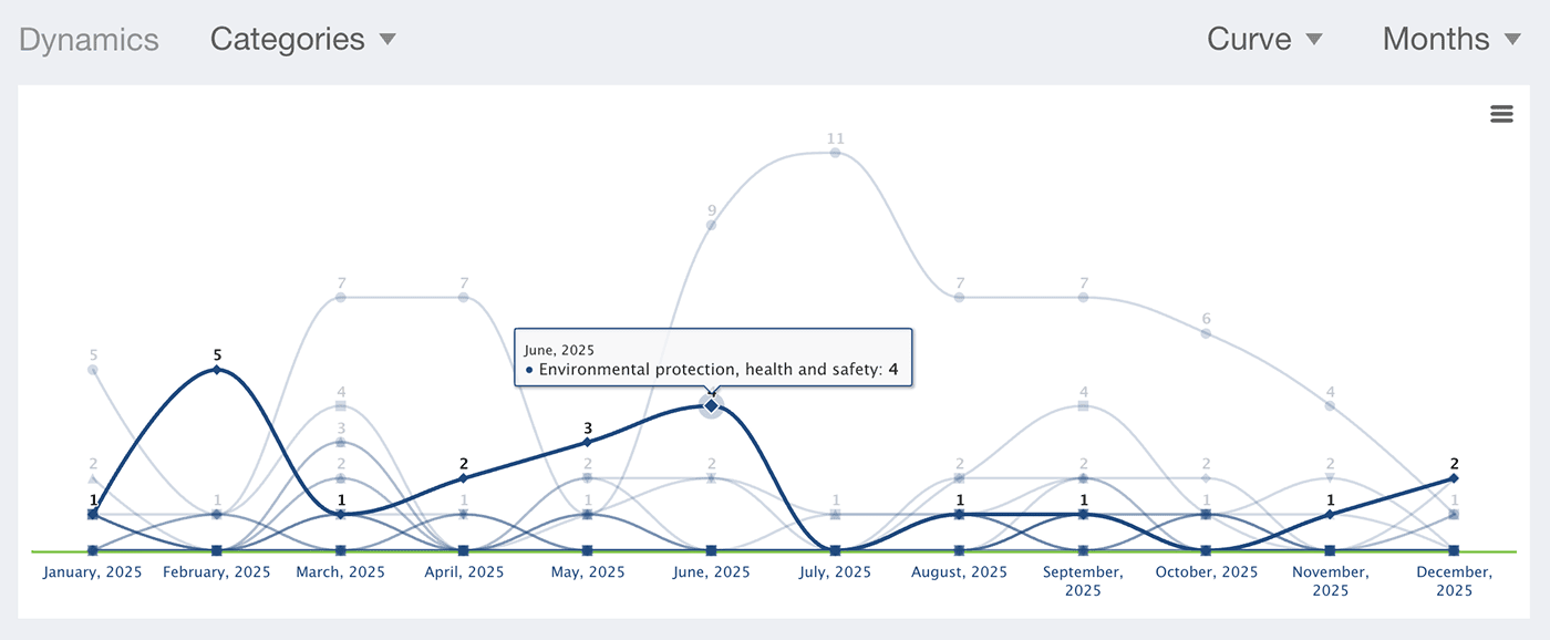
Choose the indicator or group you want to analyse and select how the chart should be displayed.
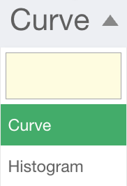
- Curve
- Histogram
A Curve is useful for following changes and trends over time, while a Histogram provides a clearer comparison between individual periods.
Choose the time interval
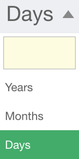
- Years
- Months
- Days
For example, selecting Categories, Curve, and Days allows you to review daily changes in category-related reporting activity during the selected period.
Choose the time interval according to the level of detail you need.
How to use the Groups report
The Groups report can help you answer questions such as:
Which categories generate the most reports?
Which organisational units have the highest case volume?
How are cases distributed across reporting channels?
Which categories contain the highest number of high-priority cases?
How do case statuses differ between organisational units?
Has reporting activity in a particular group increased or decreased over time?
For example, you may first group cases by Units to identify where reporting activity is concentrated. You can then add Statuses as a secondary grouping to see whether those units also differ in how their cases are progressing through the workflow.
Notes
The primary grouping determines the main categories shown in the report.
The secondary grouping can divide the main groups by Channels, Statuses, or Priorities.
Select Without stacked bars to display only the primary grouping.
Filters determine which cases are included in the analysis.
The Dynamics chart can be displayed as a Curve or Histogram and grouped by Years, Months, or Days.
Available groups, filter values, and organisational levels depend on your organisation's configuration.
Access to the Groups report depends on your user permissions.